
Sunday, 29 June 2014
Friday, 16 May 2014
Tuesday, 13 May 2014
Friday, 9 May 2014
Tuesday, 29 April 2014
Working Out Base Texture/Colour
Here I have compiled a few textures that I have been look at for the base structure. I have been trying to find a texture that well go well with the other objects yet refrain from being to 'busy'.

1
I started off looking at cherry wood but found that It did not really blend well.

2
Here I looked at some dark and light woods. I find my self quite liking the bottom right wood as I very much like its texture (not to busy) but think the colour does not quite match the objects. Upon some exploration and some tips, I believe the problem with the colour of the wood comes down to the hue. Like the bottom image, I think that the colour needs to be warmer to fit with the objects. I intend to take the bottom right image and get a mix between itself and the warmth of the bottom image.
Light Up The Intro Experiments
(Note: These are not the true colours. They have been washed out slightly)
Here I have returned to looking at the lighting for the intro. I had at first found image 1 to be the most appealing but upon some experimentation I found it to be quite dark to which I had not noticed before. Although these lighting experiments are not vastly different from one another, I find my self quite liking and stuck between 4 and 5.
Within these experiments I have used three types of light; Spot Light, Point Light (base light) and Area Light.

1
After some experimenting with the light, I found the bump map on the copper to be to extreme and reduced it from 5 to 0.100.

2
To light up the scene I used a spot light directed towards the scene.

3
I then noticed that on the back wall some funky line (image above) which ended up being that the brass had a slight transparency to it. I turned that off to which fixed the problem and made the lighting flow a tiny bit nicer.

4
Thinking that the spot light might be a little to bright I dimmed it down slightly (so to get rid of the bright light spot) and added a dim area light bellow facing up. This gave a nice light and still allowed for some shadowing.

5
With this experiment I tried something slightly different. I got rid of most of lighting but placed an ambient occlusion pass on the white back drop which also runs underneath the set. I believed that the metal has reflected this and has brightened up the scene. Its not much different from image 4 but feels a little more clean (less shadow).
Monday, 28 April 2014
Pre_Viz - Building The Animation
Looking towards the animation, I have done a pre_viz before I fully commit to the final outcome. This is mainly to test timing and to see if I have missed placed or need to edit objects position.
From this I have learnt that I need to have a look at the frame size between maya, after effect and premiere pro as I seemed to have gotten this slightly wrong this time around. I also feel that the text needs editing to a different font as I feel that it is hard to read and does not fit the animation.
Friday, 25 April 2014
Setting Up Intro
I have now turned my attention to the intro of my animation. I had wanted a very metallic theme for the intro (in contract to the rest of the animation being made of natural wooden textures) but on apply the copper texture to everything as a test I was a little put off (image 1).

1
Copper Mad!

2
Lighting It Up
Still using the copper texture, I placed some basic test lights. I made it a little more appealing but feels a little to clean with its shine and reflectiveness.

3
Introducing Brass
Here I have swapped the back wall, fittings and fancy gear with the brass texture. I was unsure of this at first but coming back to this image, it is growing on me. The copper texture still feels a little to clean.

4
Lighten Up Mark 2
Moving around and duplicating the light I have lightened up the scene. I am unsure of this and feel that I have lost something that I had in image 3.

Improve Earth Texture 2
From some suggestions, I have swapped the dark and light colours around so that with the bump, the land mass pops out rather than the sea. I have also darkened the light coloured wood so that it has a more of a warmer feel to match the rest of the line up.

Improving Flower Texture 2
Here I have darkened the petals so they are a little more brown so they do not feel alien to the rest of the objects with its light, almost painted feel.


Improving Earth Texture
The earth took me the longest to figure out with how I would show that it is the earth. I am quite fond of this texture as even as a stand alone object I find it quite appealing. I think the bump map works well with this object with it indenting the land mass.

Improving Peg Family Textur
For the peg family, I changed/edited a lot of its textures as I had wanted the three to fit together but also have there own identity in there colouring. I quite like them as they feel like they fit together nicely.

Improving Cow Texture
I quite liked the cows basic texture and thought it suited the cow well. I made some minor changes by highlighting and darkening areas to try and get thee that this is aged.

1
Line Up

2
Cow Extra's
Here I have textured the extra's that follow the cow. I wanted a cottage sort of feel with its colours that would go with the cow. I quite like this although the base stand may need darkening slightly as it may be a bit to bright.
Improving Sheep Texture 2
After having some feedback around the sheep I decided to do some slight changes. The texture has stayed the same but I have edited the model slightly by giving it a stumpy tail and indenting the 'wool' around the neck and legs to get rid of the sharp lines between the two textures.

1
Line Up

2
With fence.
With the fence I had wanted a colour that would not clash with the sheep but would blend with her. I quite like the texture and think it fits well in the line up.
Improving Apple Texture
After tweaking the leaf for the apple, I have simply changed some of the colouring of the texture. I have made the stem darker and the leaves slightly lighter.

Improving Crop Texture
The crop texture has been more of a struggle than necessary due to it being quite blurred. I experimented with other texture with little success. I ended up sticking with its old texture but tiled and shifted the colour ever so slightly to which has improved its quality.

Tuesday, 22 April 2014
Improving Flower Texture
Another main object that was bothering me was the flower. Although I liked the flower head, the base of the flower seemed dull in comparison to the head. I lightened up the petals and shrunk the texture for the organ middle (I'm not quite sure what this is called in flower terms) as to get rid of some of the blurred parts of the texture.

Improving Bee Texture
Here I have up scaled the resolution and tweaked the rotation and size of the texture. I like it a little more now as it was a tad blurry before to which has been addressed. I also like my bee for its yellow colour to which I had wanted to retain from the old pre_viz bee.

Improving Sheep Texture
Now that I have use of a faster computer I have begun to re texture my objects. However, as the sheep was one of the few that bothered me with its blurry texture, I have used this as a test subject. I have upped the resolution from 75 to 150 and edited its texture. From the base, I have also tried implementing a darker wood for the head and legs as to distinguish the wool.

I quite like 3 as to me it is the most successful as it presents the face quite nicely as well as the legs. With the legs in no 4 I moved the darker wood down a little as to represent some wool on the legs. I am unsure on this as it (to me at least) looks off.
There will need to be another go over to tidy up some lose bits but I am now more happy with how it stands.
The Slow Easter Texture
Over Easter I had my first crack at texturing my figures which was a very slow process due to some technical difficulties. However, its nice to finally be able to see a small line up to grasp what works and what does not.

The textures need another layer of finessing but so far I think are working well. There are a few texture that seem a little out of place. The flower and the earth (the one at the end on the right) are the ones that stick out to me. Im not quite sure what to do with the earth, weather it needs to be lightened and then have some details painted on such as land mass etc. With the flower I feel the base of the flower works however, either the stand or the leaves need changing in colour as they seem a bit dull.
Thursday, 17 April 2014
The Metallic Textures
So here I thought I would do battle with the metal textures for my screw, stands and gears. The two metallic textures I will be using is a copper and brass.

1
Brass in the making. For this I combined the presets of copper and chrome and then tweaked the reflection and colour. I then added noise to the bump map to add some texture.

2
Here is the brass in comparison to the copper texture I made for the stands. I quite like the comparison as it shows that even a little bump map adds a home new feel to the texture.
UV Object Line Up
UV Mad. Here I have been readying everything for the texturing that is to come.

1
Here are my main objects from the screw, all the way down to the earth. They are all nicely Uved and ready for texturing. However, The screw and stands are not uved due to it will be a maya made metallic texture.

2
Here the are side items, the little extra objects for the cow and the cogs to which I think look very pretty in the metallic textures.
Tuesday, 15 April 2014
The Apple Edit Continued
What I have done here is address the comments made around the leaf. I have smoothed the flow and curve of its shape to try and bring it back to feeling more like a carved leaf.

Gear Remake
Looking toward finessing the gears, I made 3 base gears to get the design & size ratio to which can be applied to larger gears that will allow them to fit together nicely. I quite like the idea of having block gears with a few pretty gears (like within my Pre_Viz) to add some more design.

1
Smoothed Blocked, Base Gear.

2
Smoothed Design Gear 1.

3
Smoothed Design Gear 2.
Even though this is very much like the design in image 2 but with straight prongs rather than curved (middle support). I quite like this one as to me, in my mind, its what a gear looks like.
Screw Edit
Going on a comment on the first screw, I have made 2 more edits of the screw. I have tried to make the screw look more industrial and old in its design.

1
Line Up.
Going from left to right was my first screw, my flat headed screw and then my more curved screw. I quite like both of the new screws but I'm leaning towards the middle due to its body shape but the one on the right due to its head.

2
Angled View.
Angled View.
Sunday, 13 April 2014
The Screw
As one of the smallest and yet almost one of the most important parts to my short, I have tried to create a small screw, to which, I quite like.

Cow Extra's Remake
Now that most of the main object have been made, although still need some editing, I have begun too look towards the smaller objects. Here I have have edited the extra parts to the cow, the stall, cheese and the milk churn.

Sheep Edit Continued
In my continuation of the sheep, I have edited the sheep to give it a beveled edge so to follow the style of the cow. I have also experimented with adding indents for the body of the sheep to add texture of the wool.

1
Beveled Base.

2
Here was my end result of the experimenting with adding indents to add some extra feel to the wool. I tried bring the indents all the way down but found that I preferred the small indents to symbolise the texture. The rest of the texture will come with the wooden texture and its bump map.
Sheep Edit_Ears!
Continuing to edit the sheep I have given it some ears. I did a little experimenting with the ears and came up with 4 types of ears. I quite like D as I think it fits its jumping pose and looks quite sheepish. I still need to add a slight bevel around the shape of the sheep to smooth the edges of the sheep. This is also to make it more similar to the cow in its carved style.


Thursday, 10 April 2014
Sheep Remake
Follow the simple design I have tried to keep that flow with the design of the sheep. As it is mainly seen on the side view (as it is the only non rotating object) I was more concerned about how it looked from the side. I quite like the sheep although I wounder if its to simple. I still need to tweak a few things such as adding some imperfections (example- having the legs differ rather than being in the same position).

1
Templating the 'jump' shape.

2
Multi view.

3
Side main view of the sheep. There are a few places that need smoothing out but on the hole,I quite like my little sheep to which looks and can be identified as a sheep.
Tuesday, 8 April 2014
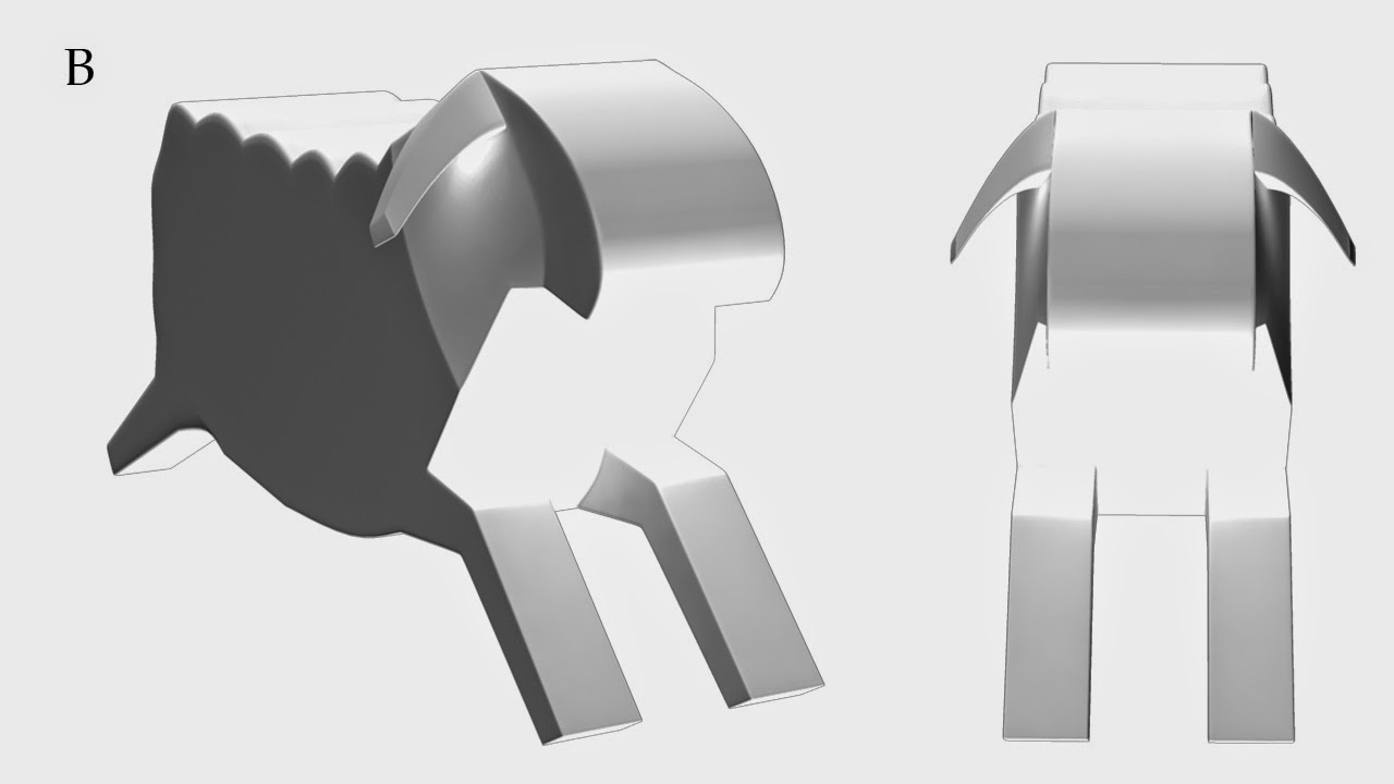
Cow Remake_2
After some editing and tweaking I have come up with my cow. While modeling the head I found that the simple shape worked rather well. I added the horns but did not add the ears. This was due to me liking the simple shape which I think works but, I am 50/50 on if I should add them. I also intend to add some cracks and indents along its body at a later date to add age.

1

2
I did two tails with different ends due to how I am going to animate the tail. I am a little unsure how it shall move (like wagging side to side or flick up and down). This is so I can go either way with out having to remodel its tail later down the line.
Subscribe to:
Posts (Atom)