Sunday, 17 March 2013

Set Design

Going on a comment of it looking cluttered I took out the background buildings


1

2

3

Again just doing the basic tones from more of a dulled colour to a more blocked colour.

Set Design With Colour

Here im looking at the intro tutorial/demo thing. Im then applying some of the colour tests with the style of the buildings from before.

Ive been thinking on how the game will play out, not just making the game about bring the world to darkness by taking out the lights, I mean how the character actually can climb up buildings, how he will move from on to the other and then bring this all together. So the idea is to add a little bit of detail to show a ledge for example to jump onto to get a better shot at a light or to jump to another building or a higher ledge.

Thumbnail of intro.


Putting into photoshop.


I quite liked this one for some reason. Even though its not got any added smoke/fog to it, it really stands out to me.


Colour tests applied.

1

1-2

1-3

There's something about the purple I quite like. I still prefer the dulled down ones such as 1-2 as it has a nice atmosphere.

2-1

2-2

2-3

2-4

I do like the simple tones of these, specially 2-3 and 2-4. I quite like a coloured smoke though as for me it adds some atmosphere.


Getting Ready For Maya: Character Turn Around

 So slowly getting ready for some maya modelling. Here is the turnarounds getting ready for maya.

Front

Side/Arm


Turnaround


Speed Painting Challenge 1-10

This was quite a blast. Its a crying shame its over as this was all rather relaxing from the norm. Heres hoping we get to do this again!


SPC1

SPC2

SPC3_01

SPC3_02

SPC4

SPC5

SPC6

SPC7

SPC8

SPC9

SPC10

Saturday, 16 March 2013

Set Colour Tests 2

So here Ive gone through a few experiments. I went back to the purple (going on a comment from before) to see if I could push this to something that I both like and feel could work. I started off simply with greys as the norm then slowly went upon what I already had and adding to the colours and playing with tones.

1

2

3

4

5

6

7

8

9
Here I went a little to purple/dark for my liking so i drained out the colour a little for the next few, again playing withs tones to see what effects I could get.

10

11 

12

13

14

15

16

I then slowly went back to the purples. In the end I quite like the purple (not full on purple but an added tone of purple) as It dues make it feel like night time. 

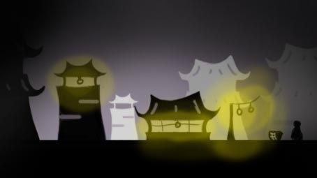
With most of these Im not really getting the depth/ atmosphere with the purple like i did with simple tones in this lot and the lot before. In this lot I quite like 5-9 and 16 with the base purples. With the more tonal ones i liked 3-12 and 14. I quite like the added touch of purple but im still leaning towards more of a tonal background due to japanese colours (inks) are quite dull/drained (though not always) and I think a block purple colour is pushing it a little to far. Also with the tonal ones I find it has more depth and atmosphere.


Friday, 15 March 2013

Set Colour Tests

Here I have set up a small scene and have begun to try out some ideas.

Here I begin by really making my world dark with white light from the lamps to light up a section of the mock up set.  (no 1) I then go about lightening this up and adding some background details that begins to blur/wade out to try and get depth and atmosphere. (no 2-3) I then add a little colour shading to this (no 4). I quite like the idea of maybe the hole world is colours in tones yet the lights actually are the only thing coloured and colouring the world. I also like the idea of the world becoming black as you take out the lights as well. no 1 maybe a little to dark for this but no 2 may work well as you can still see the set it self.


1

2

3

4

Moving onto adding more colour to try and get a more painterly feel, this dose not work for me, it just becomes a distraction from what the player should be looking at. (no 5-6) no 7-8 are not bad but i get no sense of atmosphere or depth unlike the 1st 4 images.

5

6

7

8