
Here im looking at the intro tutorial/demo thing. Im then applying some of the colour tests with the style of the buildings from before.
Ive been thinking on how the game will play out, not just making the game about bring the world to darkness by taking out the lights, I mean how the character actually can climb up buildings, how he will move from on to the other and then bring this all together. So the idea is to add a little bit of detail to show a ledge for example to jump onto to get a better shot at a light or to jump to another building or a higher ledge.
Thumbnail of intro.

Putting into photoshop.

I quite liked this one for some reason. Even though its not got any added smoke/fog to it, it really stands out to me.
Colour tests applied.

1

1-2

1-3
There's something about the purple I quite like. I still prefer the dulled down ones such as 1-2 as it has a nice atmosphere.

2-1
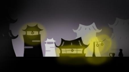
2-2

2-3

2-4
I do like the simple tones of these, specially 2-3 and 2-4. I quite like a coloured smoke though as for me it adds some atmosphere.
I think the building's shapes are too distracting, too cluttering, I think the the character would get lost among them. I know he's supposed to be almost invisible in the dark but the player will still need to see him. Or perhaps it's the white buildings in the background throwing it off? Try 1-3 without the background buildings just to see how it looks?
ReplyDelete