Wednesday, 27 February 2013

Platform Games

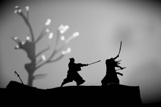
So to get my self back into my world im again looking into platform games. Im look at a mix of white and black, coloured, layered and camera placement.

In my original idea was to have at certain point to allow the player to move the camera 180 into a different position. However to begin with it will be this kind of stuck camera at the side yet allow the player to explore.


1

Looking at no1 for the merge between set and character.

2

3

2-3 for the set and ideas on how i can make the player play the game.

4

4 was to look at how I could get the character to walk to the back of the map.

5

5 Was camera movement. In this game you'd move the camera to work out routes within the game.

Set Research

So just looking into some free online games that use the simple black backgrounds. The game it self is simply work out ways to kill the sentries. Obviously mine is all abouty stelth and a little less cartoony but I like the simplisity of this and the way the character has to jump up things etc.


Ninja Rampage


Ninja Rinseout

Tuesday, 26 February 2013

Costume Design

So even though my character is ultimately going to be a silhouette I think it would be nice to have some highlighted details in his clothing to show his status and clothing. Some here are a little futuristic while others are more period set. I much prefer the period set ones such as 5, 12,13 & 14. Im after a simple pattern design to be highlighted like the face will be. Ill be look into some embroidery to finalise the patterns if needed.


Nearing The End

Today I did some more experimenting with mixed results. I started off with no1 which was from a prevues post and rounded it off in ink a little to see what it would look like softer. I liked both so i tried to combine them in no3. I have had mixed views here regarding these from some feed back I got from people. Some like the hard edges while others like it soft.

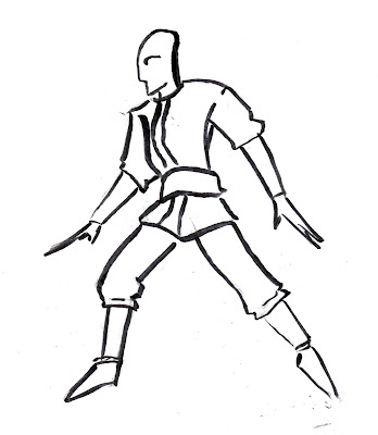
I personally like no2, the softer virsion as I feel it may best suit my environment as that will be soft, simple and clean and I feel no 2 has this more than no3. Right now i feel that no 2 is the one i will take forward now. Though i prefer the head from no 1 which ill transfer over. Im now going to look a little into the costume and not the shape to get him presentable before moving onto my set once more.


1

2

3

I then went on to experiment with making it cartoony and an in between to just get an idea of what would work better with the set. I like the cartoony one but feel its a little cute.  The in between just looks like a child but has some charm.

4

5

I then took no 3 as I was look at that to finalise my character so I tried to see if I could re draw it. I did this in a mix of ink and pen to get a feel for him. Bar the legs I feel I can draw him but theres something  lost with him. Im not sure im a fan of hard edged arm meets soft legs. 

6


7

8

9

I did some more thumbnails just simple adding or taking away some details to let it all sink in. 

10

11


Ninja Costume

So im having a look at some ninja costumes. Im looking at this now really for the shapes but the designs on them. Im intrested in making some kind of design ontop of my character to show he is like a high status in his feild of assassins.

1

2

3

4

5

6

Set Refrence : Ninja Assassin

Little known to me the turn of fate would leed me to this game. I have never herd of it before and never new it exsisted. The 'Ninja Assassin' based on the film by the same name. I very much liked seeing this as though my idea is slightly different in design this has helped me visualise how I wanted my set in camera persition and distance from characters. I new what I wanted just could not fully visualise it fully and this has helped.


Sunday, 24 February 2013

Character Build Up

So using no's 2 & 3 from the last lot I began to work into them mixing/ combining ideas to see what worked and what didn't. Again I like parts from a few of these. I like the leg decor on no6 & the over all shapes of 7 &  8.

1

2

3

4

5

6

7

8

Come Back Of The Ninja Assassin

So working into the costume of my character trying out different styles as well as different out fits. I like a few of these for different reasons. 1 & 2 are the ones I like most. I love the simplicity and the flow of the line though Im not a fan of the chest. While with no 2 I just think its the best all rounder. Simple and to the point while has shape to which will add to the character when he is silhouetted. I like the head of 4 and the chest of 3.

1

2

3

4

5
6

Saturday, 23 February 2013

Tracing Paper Test (Set)

Going from my london trip  and seeing the sheets of plastic with images on them to add depth I have tried to have a go using some stuff I have already drawn. This was an experiment how it would look. Its a little dull and needs a little more mumpf in there. But for the test I think its gone nicely.


1

2

3

4

5

6

7

8