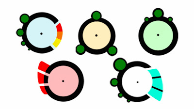
From the seleftion I did before, I tried to add some basic colouring to show the health and power bar. This was a quick way to see which ones would work the bets.
Base
From these I picked the first one to explore in more colour. In this first lot I tried some softer and harder to get a vision range of colour. I believe the ones that work the best are 1 and 4.
Lot 1
Going from the light and soft colours I continued down this route to explore this a little more. Having to much softness makes it kind of blurry and hard to see (like no 5) but a mix of hard and soft worked quite nicely. From this lot I like no 1 and 3 as i feel the hard and soft complement each other.
Lot 2


No comments:
Post a Comment