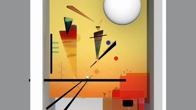
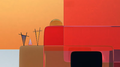
I decided to have a close up rather (how the shots would acutely be) rather than being zoomed out. This is to see if the plainness of the background takes away from the painting backdrop.
Plain-zoomed out
Player ball in center. It has not texture but I do quite like the white as it may not fit with the span of colour of the art but fits nicely as it does not clash with anything.
I love this shot. Even the colours are not 100% the 2 triangles on the left came out better than expected.
All in all I quite like the plain backdrop and do not feel that it takes away anything from the set. However I might to to explore the backdrop to see what it would look like if I did apply object into the backdrop.


No comments:
Post a Comment