Wednesday, 30 January 2013
Last Samurai
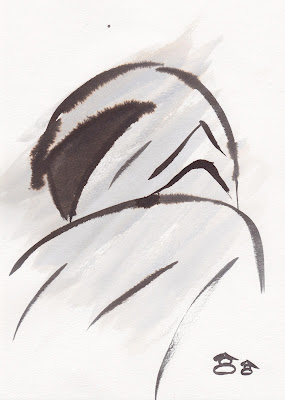
While having lunch I found my self watching this. Its a very simple story and is very simply done but its done in such a beautiful way I had to watch it 3 times before I could stop. This is also giving me more ideas on ink work and I way find my self branching out to get coloured ink. I love the colours as they are very block and suttle yet so nicely defined by the minimal black line.
Tuesday, 29 January 2013
Fun With Ink
So going from todays feed back and a recommendation from Phil to try experimenting with ink instead of going straight to my tablet has led me to this post. At no point here was I really looking at my acturle character or set, purely experrimentle work to which I found rather fun. I have a lot to try out and I have yet to look more into japanese ink painting styles etc but this was rather fun to get used to painting with ink. Enjoy :)
1
2
3
He had to be done.... I love him as a character and may not be made in this project but I tell you he will be made! :)
4
5
Sammy's master work and contribution to my experiments :)
6
7
No idea why i ruined this this a sword but enjoyed the simple lines.
8
9
Ink seems to remind me of water colour, I was never good at water colour but I love how simply applying water changes the ink so much!
Monday, 28 January 2013
More Thumbnails On Set
So I think I finally have the style sorted for my set. I like having it simple and minimal. Its coming to the time that I start filling in the blanks for the actuarial set lay outs.
Here I just doodled, most of which can be seen in other thumbnails but its coming to the stages of me actually mapping out choices within the sets now instead of focussing on looks.
Character Thumbnails
Okay so im still trying to find the right feel for my character. Im trying a range of ideas from more cartoony ideas to trying to get more 'real' characters yet retaining the sharpness to him. I have been trying the idea, like my set, to do it in very simple line and not going over the line so its more like the japanese prints. This overall didn't go to well. With some of my previous post as well they just seemed to curvy or just didn't seem to fit the world.
I still want simple line work and thats what lead me to image 3. The character it self is overly heroic and maybe to cute? So character design whys he needs re doing but the feel, the simple line work is what im after.
1 2
3
Sunday, 27 January 2013
Interactive Objects
Although this is a little bare, Im trying to work out the things/object the character could interactive from the set it self. Im still working on the idea of minimal and simple line work here as well. So far these are the 4 objects that the character could use. The tree, rock art and basket to jump onto to get to high places. The screen to hide behind and find hidden items while the basket also can be broken to also find hidden object.
Simple Buildings
Okay so whats going on here is me just experimenting with simple line work to try and mimic that of that you would find in a print. Im also trying to make them flat yet look like there 3D. I feel that if its all dead flat you will never feel there is depth in the game.
Set Speed Paintings
Here Ive used the thumbnails from before and spend 15 mins speed painting them to get some colour in there with the layering. I quite like these but im now feeling there is not enough in there?
1
2
Basic Level Ideas
So trying to picture how far from the character the camera should be and how the levels could play out and look I came up with these thumbnails. Its just simply 2 sections that would/could fit together. Ive Also Tried to show the idea of choices and how they could effect game play. So here its simply the idea of hidden items that could help you in that level and maybe the level after while if you mist these items you may lose a path you could have taken with the item. (as shown in the images-item found in 1 that helps in 2)
1
2
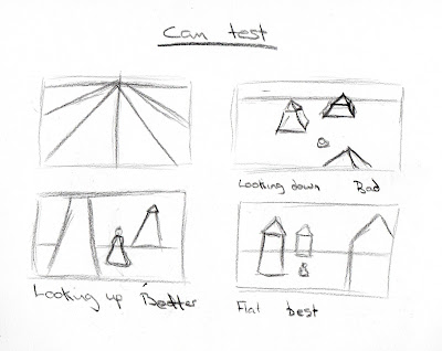
Thumbnails - Game play - Camera
So these really go with the last post of me venting my ideas down on here.
With these im looking at how flat the would should be, how to try and add depth yet keep it 2D and finally how the player can interact with the set i.e climb/jump up stuff.
In 1 the bottem two images are of how the player can use the set but also how the camera views the set weather 2D straight on is the best way or showing some depth is better. Its also looking at how much of an area you see with the character.
1
2
Thinking Out Loud - Working Out Game Play
Going on the idea that for my games mechanism the camera remains where it is at all times I've been trying to work out how I would layer my world. I plan to make everything flat so most of the world would be 2D with some 3D elements.
Ive also been playing around in my head of how would actually play out. I had first thought that the character could free roam in the world a little but thats lead to the issue of how much of the map/level to I actually show with the character?
This lead me to a few ideas; I could have it so the character is zoomed out of (so a small character) and see most of the map. This idea dues not sit so nicely in my head due to the size of the world it would need and to me would not really feel like an arcade game.
The second idea was to zoom in a little into the character but allow the character to move the camera left or right depending on the direction the character is going. This would show less of the map but would allow the player to focus on a small area of the map and manoeuvre in that space.
The other idea is to find the middle of the 1st to ideas so the camera never moves even with the character. The camera would cut to the next section of the map once the player had walker out of the 1st. I like this idea also as it would just show a certain bit of the map at any one time.
I like these last 2 ideas the most, small map exposure but allows the character to explore that area to find hidden items, notes, paths or other such things.
Character Thumbnails
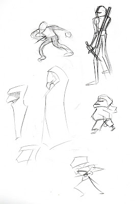
Im not really going into details here. Im really just trying to find the right kind of feel for the character so it matches that of the game style. I want the character in the game to be smallish and simple really. I see this as being an arcade game or something that would be for a IPad game.
1
2
Here I was trying out a couple of styles to see what kind of character would work. I see him being either one of the 2 on the left. I like the far left as i can see it being more like blackwater gospel with the very sharp lined characters. Very much like how the character is described in the book. I also like the idea of making him a tiny character as i think it would sit nicely with the background but yet may not sit well with the book itself.
Ninja Gear Research
Now Im not really trying to make a full on ninja as they are not mentioned by that name, simply assassins and wet boys. So really going on japanese historic culture I had too look at them. What Ive noticed though weather it be in games, film or re-enactments there costumes are always very similar. I will properly use some of these similarities but then change others.
1
2
3
4
5
6
Game Character Design Research
Mini Ninja
Im looking at these characters as they are very simple in design and colour. Even in game they remain so. Im not after something so cartoony for mine but something as simple.
1
2
3
4
5
War Hammer Dawn of War
I look towards these more for costume. Even though the characters are very blocky in game the designs are very nice. I look towards the a select few due to the idea of making a character that has maybe a tight or semi tight clothing underneath maybe something baggy. I still want him to feel a little menacing as that is how he is betrayed in the book.
1
2
3
Japanese Buildings.
While re-reading the section from the book that I had planned to make the set for it came to my attention that it was a lot small than I had first thought. I still want to exaggerate a little with the set but still keep it similar to the book at the same time, so I look towards smaller building designs.
Also I added the image at the top right due to the idea of minimal line work. Could be good to try ad keep that factor in my work.
Saturday, 26 January 2013
Game Speed Painting
So trying out something new I decided to get started by doing 5 speed paintings that lasted 20 mins tops to get my ideas flowing onto the page. I was mainly working it out as I went (so not going from any thumbnails here) to try and work out style, colour, tones etc. Although some are miles away from what im after they all still helped me along to the next and get rid of horrid ideas and helped me make some more ideas.
I like 3.5 and 5 the most out of these although if I had to pick a stand alone it would be 5 by far.
I like 3.5 due to the very simple overlay of textured tone, makes it a massive contrast to 3. Very gritty and dirty, very nice.
However no5 by far for me out shines the rest as its taken its roots from the rest and become more or less something I could see in a game. I even added a health bar and Talent bar in the bottom left to try and make it as game screen as possible. I also like the simple colour pallet as i think the black lines and highlights from the moon just make it pop for me. For a speed painting Im quite happy with its out come.
1
2
3
3.5
4
5
Camera Thumbnails
While Rendering some lovely maya I just did some quick drawings to try and work out the camera angle for my game.
I also looked at some dark colours to see what be good for a dark mood.
Japanese Castles
Looking at the architecture of the castles from around the 1700's in Japan. The shapes are very much important to my work to try and get that grand feel.
Monday, 21 January 2013
Sunday, 20 January 2013
Looking Into Old Japanese Culture
So looking into the japanese culture has given me a new insight into the world I wish to build Both the the art work and with the people.
So looking into the old culture I discovered some stuff one a norm japanese family. I never new the relevance in the book until now but, what I discovered was it was the norm for a husband to find sexual encounters out side of marriage. In traditional japan, men were never told to be faithful. The rule was the ideal wide was a mother and manager of the home. So when the man wanted, he would go to see a courtesan.
In the book it has a part where the man chooses his wife over this. So has some hidden cultural meaning there which I never fully understood to which Im sure I will be able to use.
I also discovered the art form of japanese printing to which I would love to incorporate into the art directions of the game. I love the flow yet somewhat sharp lines to the print and think would work well in game.
1
So as the norm I had to look up some castles as It will be these kinds of structures that you would have to sneak into. This has given me some ideas on the layout of planing this. Its shown me that the are not always about how high they go, the level spread off into different buildings. They can be quite tall yet some can be quite wide, almost like having many buildings in one.
2
Subscribe to:
Comments (Atom)


