Monday, 31 March 2014

Editing Intro - 1


So the last piece to the puzzle is the intro of the animation where the lone screw begins its chain reaction to bring the machine to life. 

I tried to bring in a handle to which would start to move after the screw screwed in place. I think in this edit it maybe a little to busy and Im not sure on the handle placement. I think it may need to be more connected to the screw by maybe having it underneath rather than to the side. However, I do like the delay before the cog begins to turn ( the one behind the screw) rather than the instant turn with the handle.

Top Image Test


Here I was exploring the idea of having images (made from different coloured wood) on the top of the rings. These images would be both to improve the aesthetics of the machine and also bring the Bee back into the final shot. 

I quite like this shot and believe the rings sit better with the combination of the bee rings with the flower rings.  Obviously the image will be textured from different shades of wood rather than this test using the paint in photoshop.


The top image looks a little different in colour, I think this is due to lighting as the colouring is more closer to the top image. I think when the shades are more defined it will make the image more clear but I think in priceable it works but will need some editing.


After Effects Test


It has been a while since I used After Effects and as I need to use it for some small editing I thought I would do a little test to work out where things are or what to look out for to fix before being imported.


This has a few problems with frame size, odd borders and jumps. This is down to the using Premiere Pro before hand and a few odd settings. This was good to get to grips with setting and learning where everything was to make everything flow more smoothly.


Here I tried correcting the mistakes to which has made it flow more smoothly and got rid of the issues around size.  The intro of the screw is a little doggy due to its dirty shadows which is a result of it being a pre_viz and thus should not be a problem.

Sheep & Cow Movement Tests


Exploring the secondary animation, the sheep and cow rings are slightly more technical than the others. I have attempted to give the sheep and jumping motion and the cow a bobbing head (possibly a tail when I remodel her) as well as turning the objects behind.

Sheep Test 1


With the first test I explored having the sheep jumping over the fence by having the fence stand static on the ring and having the sheep's follow the motion of the ring. When played however, the static fence stand out and looks rather odd and alien to the rest of the moving contraption.

Sheep Test 2


To change the static feel that the fence gives off I reversed it so the fence moves and the sheep stays in place. This is was due to that, even though the sheep win the in place it will not be static due to its jumping animation. I think this works well and stops the feel of the random static object in this moving world.

Sheep Test 2.5 Camera


Cow Test


With the cow, all I had wanted was something rather small to brake up the solid body of the cow. Under the cow I have placed a mostly hidden mechanism that in turn moves the head up and down. I may add a tail as well when I re make the model as I think this small movement, plus the movement of the objects behind works well.

Cow Test Camera

Old Thumbnail Catch Up

While working on my Pre_Viz,s I have been neglecting the sketches and thumbnails that have helped me along. So here I have complied some of these thumbnails as, although some are out dated and a bit sketchy, it would be a shame to miss them out as they have helped me get to where I am now.


Starting with the more resent sketches, Here I was working out how the rings and objects could rise and fall with the secondary animation. A bit sketchy and ruff but helped me jot down ideas to which some have stayed and some have not.

Image 1


The objects with there secondary animation mapped out. Only minor movement but will help bring life to the mechanics of the machine.

Image 2


Here I was looking into the final view of the machine and the possibility of having some sort of coloured wooden image on the top to represent the meaning of the machine. I looked into a tree, planet, the sun and the Bee to witch made the most sense being that its all about the Bee.

Image 3


Looking into putting a handle on the machine.

Image 4


Working out the best way to make a sheep jump.

Image 5


Finally, The oldest thumbnail here so looking into the camera movements to which I tried and edited to fit my animation.

Image6


Tuesday, 25 March 2014

Camera Rise Tests


Here I have been looking into the camera rise to the above view. I have done a few iterations with minor tweaking in each trying to find the smoothest way to do so.


I started off trying to attach the camera onto the last layer and make it follow the planet as the camera rises. There was a problem with this and its rotation due to the rotations of the other rings. When the camera attached to the planet, it made the other rings slow down and speed up depending on the direction of the ring. It also made the planet look like it was not moving.


I then tried having the camera rotate around the center point. This stopped the problem with the planet and dulled down the problem with the other rings, but the speed difference is still visible. 


To get rid of the ring rotation speed problem I decided to get rid of the camera rotation but keep the sweep up to the top view. This worked okay and got rid of the rotation problem but seems rather distant as it rises.


Finaly I edited the camera movement again slightly which would allow the camera begin to zoom out slightly later rather than at the beginning of the movement to the top view.

Tweaking 2 _ Pre_Viz


Note;- The gears at the beginning are simply a place holder.

Here I have done some minor tweaks to the timing between each object and rise of the tower. I have also edited the height of the tower slightly to become taller.

Monday, 24 March 2014

Tweaking & Testing - Pre_Viz


Working on the pre_viz I have been tweaking the camera, how the objects come into shot and the rising tower. I am still working on timing but I think the rise works well and is timed nicely with the new objects coming into shot. I also think the pop in of the objects into shot works well with it taking up the hole screen (rather than being under the cam like the old Pre_Viz).

However, I think after watching it player out that the rings are spinning a little to fast and need slowing down.

Friday, 21 March 2014

Depth Of Field Tests


Today I have been experimenting with Depth of Field to which I had intended to apply to my shot. It had varying results which are shown bellow.

Base Start Image

Step 1

Applying the mia_lens to the camera.


Step 2


Step 3


Step 4

Tweaking the setting allowed me to focus on the Bee but left the background looking a little to blured.


Step 5

A few more tweaks made the background looks a little nicer.


Step 6

Zooming out to check focus showed a problem. There was no focus on the closest object. 


Step 7

Tweaking and experimenting with the settings I was unable to really allow the camera to focus on the object closest. I believe it is due to the distance to the objects and the camera.


Although I was unable to master the depth of field, I did get a glimpse of what it can do and the problems that follow. It was somewhat successful however and this could probably be sorted with a technical conversation at some point.


Thursday, 20 March 2014

Rise & Fall - Cake Tower Idea


Here I have tried something out that I think has worked rather well. I have had this visual problems with everything being on one level, as it looks rather flat and leaves a lot of negative space. So here I put each section on its own level and as the camera moves out, they begin to rise (Like a cake tower). I still have to play around with the timing but I think it is both effective with getting rid of the negative space and also adds some visual interest. 

Rise & Falls Test : All Rings


Im quite liking this but I feel it is still leaving a lot of negative space at the top. A way to combat this could be a slight rise of the rings as the camera moves out (like a cake tower). There are still a few tests to go but I think it is slowly coming together.

Wednesday, 19 March 2014

Crops & Apple Ring added

I have added the apple and crop rings. I have tried to bounce the apple with (what will be) little pegs holding the apples up. I was unsure if the pegs would clot up the view but I think it turned out better than I thought. I can imagine them being some sort of thin metal.
I was a little stuck on the crops but liked it as a simple layer. On hind sight, I could have had something like a hay stack or two that would raise it level. On a hole I think its looking more successful and interesting.

Tilted Rings - Rise & Fall Tests

So here I am working on what makes the objects go up and down  int eh rings Following in line with the sheep jumping over a fence, I have tried to come up with ways that follow this trend. Example being flowers on a hill to represent a meadow, or an apple bouncing.

Here are the first two tests, The Bee and the Flower rings.


Tuesday, 18 March 2014

Cam Pre_Viz 6


Going on a suggestion, I have tried to put everything on a similar level rather than on differing levels. I think this has reduced the negative space  and I am visualising the field depth in place, blurring the background layers. 
However there is something wrong that as the camera zooms out feels off. I think this is the spacing between the rings as it seems to be leaving so empty space. I think I need to add/work out the flooring/ stands for these objects as this could also effect how it stands together and spacing. 

Cam Pre_Viz 5 + Sounds

Monday, 17 March 2014

Cam Pre_Viz 5


Sounds will be appearing shortly.

So here I have done some changes and added a few things here and there. I have added:

-Wild flowers
-Sheep
-A new ring of people
-Camera movements

On a hole, I quite like this as I feel it is becoming more visually appealing and interesting. I feel the the first 4 rings are the most successful and from the cow on wards is lacking something. I feel they are successful as they are more closely knitted and lively.

 I am also not sure on the mass ring that is filled with people in a line as I feel this could be better shown if  I added more families to the ring before rather than making a hole new ring?

I am also unsure about the camera movement to the eagle eye view. Maybe have it so when the planet passes, the shot slides to the over view in more swift edit rather than a camera movement.


Still images,


New Line Up


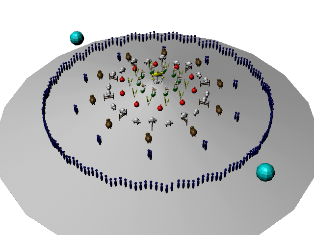
Tilted view of the rings


Saturday, 15 March 2014

Cam Pre_Viz 4

I think this has been more successful than the others before and has got rid of a lot of the negative space.  I quite  like how everything looks like they are rotating around as well. The placements/tilts may need to be adjusted as I did the tilts quite small to get a grasp of what it would look like. 


Friday, 14 March 2014

Cam Pre_Viz 3 & Setting Up 4

Here is the second lot of experiments with cameras and problem solving. Cam 3 is following in from yesterdays videos following a similar plan. Number 4 will be little bit different from the others but is similar to the Orrery Mark 3 idea a while back where the objects go up and down around the centre. The setting up of it is testing the spacing and numbers on each row.


From Pre_Viz 1 to 3, it has shown that there is a lot of empty space around the orrery and between each object. This can also be seen in the still images bellow. The design flaw is being looked into in the set up of no 4.

Still images.


1

2


3


4


So here I am mapping out no 4 exploring the spacing and size. I am also trying to remove the negative space that is present in the previous Pre_Vis's. It still needs some work around these part and needs to be tilted but so far looks promising and more interesting than the others.

Still Images


1


2

I quite like the top view, It shows that the spacing needs to be edited  but still looks positive.

Thursday, 13 March 2014

Cam Pre_Viz- 1&2


After a little chat with Phil that helped me get my thoughts back from the clouds of metal trees etc, I have gone into pre-vizing to get to understand the camera movements. It still needs some work but here are the first two attempts. The first is very basic and has quite a few problems while the second is a little more refined.


)


  )


Wednesday, 12 March 2014

Jiggle - Lot 2

Here I have been looking at some more lovely trees, this time however, I have looked at jewelry stands as well. I quite like , for its twisting metal design and 3 for its simple yet cute design.


1


2


3

A Little Jiggle

So after seeing the orrery in the Dark Crystal and a little conversation about the food chain, I have had a little jiggle with ideas. Taking a step away from the normative design of orrerys, I have been looking around the idea of making a mechanical tree orrery. 

The reason behind it being a tree is, is that if I was to picture the food chain or the chain of the domino effect, I think the way I would see it in my mind would be in the form of a tree as everything is connected.

Here I have been looking at a mixture of metal/ mechanical trees as I like the idea of the constructed thing, symbolizing a tree with these very natural wooden objects symbolizing the bee etc.


1


2

These images (1,2) have a very cubic feel and are very interesting in its design. Un-natural yet somewhat natural?


3


4


5


6


7


8


9


10


11


12

I quite like 11 and 12 here as the mixture of wood and metal connecting with each other has a nice effect.


Tuesday, 11 March 2014

Maya Texture Tests - Lot One


So today I decided to have a crack at texturing as I am not very good at making or using realistic textures out side of maya. 

With some help from Jordon, I have two basic/blocked objects from maya textured in two different ways. 1 is a texture on a plane which looks nice but could come into problems in the 3D world, while the other is a 3D model with a texture and bump map placed. I quite like this as even though the texture is not perfect, they feel real and solid, yet smooth, to which is what I had wanted.


Monday, 10 March 2014

Layering Thumbnails


Here I am looking into the camera route and the layering to which the machine could be made.


1


2

Here I am looking into the first layer to which the lone screw would be. I think this would be quite a simple layer. I have used some mechanisms from inside clocks to which look big but are really quite small. As the camera moves back from the screw, it shall pass through a hole and gears to the next layer.


3

Here is the middle layering slowly moving out of the machine. What I was thinking is having some showy gears (that are not really connected to anything but look like they are) and then some sort of layered gear that are suggestive of being connected to something above. The camera would go through a hole in between these gears. This is too make everything look big and fancy. After going through the main lot of gears, the camera would go between a few more before coming out of a decorative hole above the music player.


4

Here I was looking on how the music disk could be on show as well as the stand it self. This is just to get an idea on presentation as this will also effect the above orrery in its looks.


References


I have put some of these images up already on past posts but, I have placed them here as to compiled a few images to which I use as references in my mechanisms and presentations. 


1


2


3


4


5


6


7


8


9